1.5. 演習:ロジスティック回帰#
1.5.1. アルゴリズム#
ロジスティック回帰は、回帰分析の考え方を 2 クラスの分類問題に適用したアルゴリズムであり、例えば腫瘍の形や模様に関する特徴を利用して、腫瘍細胞が良性か悪性かを予測したり、血液検査結果から心疾患リスクがあるかないかを予測したり、年齢・病歴・健康診断の検査結果などを利用して外科手術を受けた患者が手術後に死亡リスクがあるかないかを予測したりするために用いられます。
ここで、腫瘍の大きさから、その腫瘍が悪性かどうかを予測することを例に、ロジスティック回帰を見ていきます。まず、腫瘍の大きさと腫瘍の種類となるデータを用意します。なお、腫瘍の種類について、良性か悪性の 2 つの種類あります。文字は計算できないため、ここでは良性を 0 とし、悪性を 1 と置き換えます。
腫瘍領域の面積 |
腫瘍の種類 |
|---|---|
2000 |
1 |
1200 |
1 |
1100 |
1 |
1000 |
1 |
900 |
0 |
800 |
0 |
500 |
0 |
100 |
0 |
このサンプルデータでは、腫瘍の大きさが 900 から 1000 の範囲が良性か悪性かを分ける境界となっているように見えます。まず、腫瘍の種類を目的変数 \(Y\) とし、腫瘍領域の面積を特徴量 \(X\) として、回帰分析(単回帰)を行い、その結果を可視化します。
Show code cell source
import numpy as np
import pandas as pd
import matplotlib.pyplot as plt
import sklearn.datasets
import sklearn.model_selection
import sklearn.linear_model
import sklearn.preprocessing
import sklearn.decomposition
import sklearn.pipeline
import sklearn.metrics
model = sklearn.linear_model.LinearRegression()
X = np.array([[2000], [1200], [1100], [1000], [900], [800], [500], [100]])
Y = np.array([[1], [1], [1], [1], [0], [0], [0], [0]])

model.fit(X, Y)
fig = plt.figure()
ax = fig.add_subplot()

ax.scatter(X, Y)

x1 = min(X)
x2 = max(X)
y1 = model.coef_[0] * x1 + model.intercept_
y2 = model.coef_[0] * x2 + model.intercept_
ax.plot([x1, x2], [y1, y2])
ax.set_xlim(min(X) - 10, max(X) + 10)
ax.set_ylim(min(Y) - 0.1, max(Y) + 0.1)
ax.set_xlabel('Area')
ax.set_ylabel('Type')
plt.show()
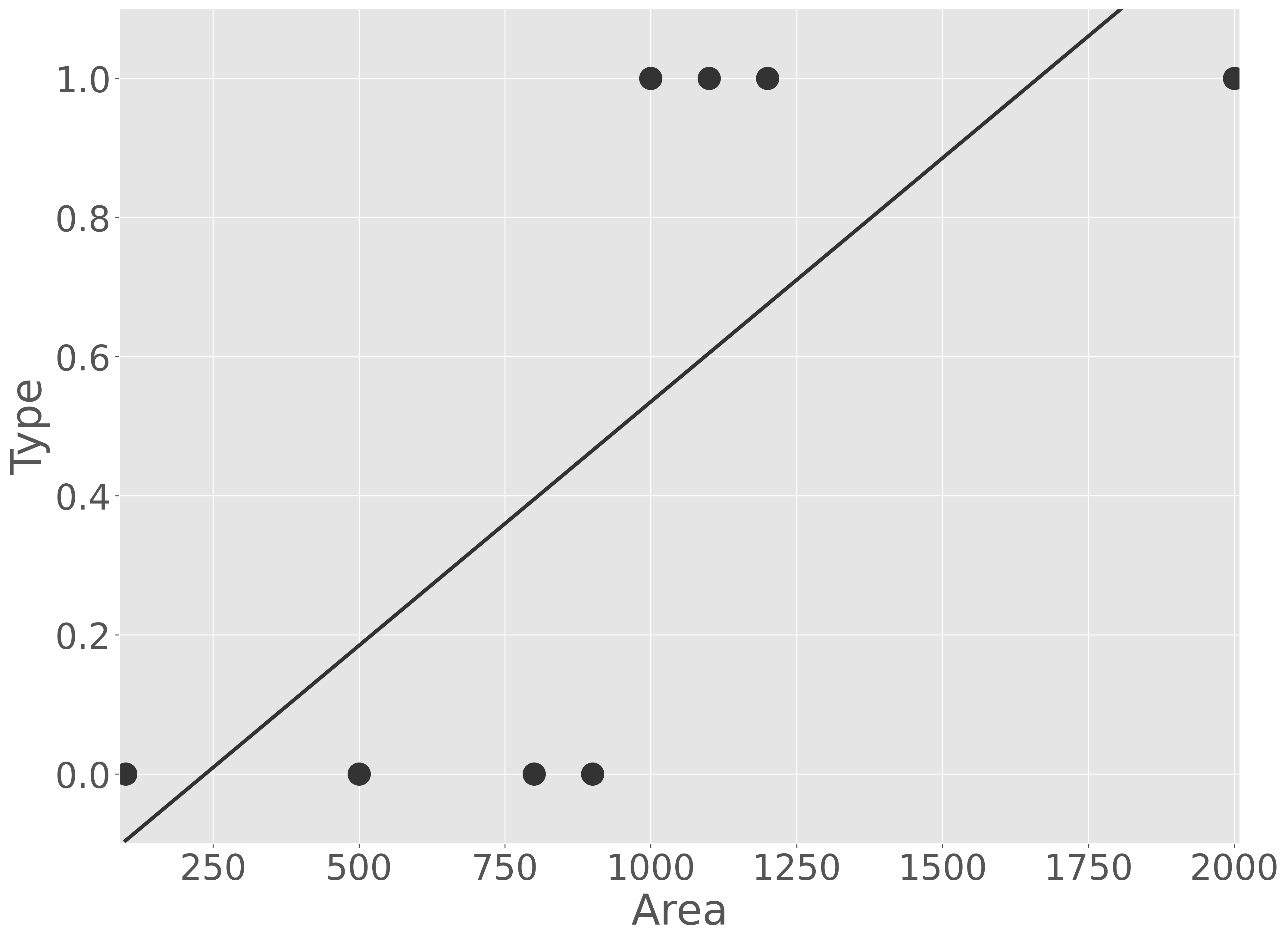
可視化の結果から、回帰分析でもある程度両者を区別できる。例えば、腫瘍の大きさをモデルに代入し、そのモデルの予測値が 0.5 を越えれば悪性、そうでなければ良性として扱ってもよさそうです。しかし、このモデルを解釈しようとするときに、不都合な点が現れます。一つは、モデルの出力値には上限および下限が存在しなく、出力された数値だけで度合いを判断できません。例えば、出力が 1.0 も 100.0 も良性腫瘍だが、最大値が存在しないために 100.0 が 1.0 に比べてどの程度よいのかを判断できません。また、観測データを確認すると、腫瘍サイズが 900 から 1,000 の間で、腫瘍が良性から悪性に急に変化する境界が存在しているように見えるが、モデルではその急な変化を表現できていません。そのため、このような 2 クラス分類問題に対して、そのまま回帰分析を行うと、解釈が非常に難しくなります。
そこで、そのまま回帰するのではなく、回帰した結果を最大値 1 かつ最小値 0 となるように変換してみよう。確率を扱う関数の中で、最大値が 1 かつ最小値が 0 の形をした関数にはシグモイド関数(sigmoid function)\(\sigma(x)\) があります。
このシグモイド関数 \(\sigma(x)\) に大きな値を代入すると、\(e^{-x}\) が非常に小さな値となり、関数の出力が 1.0 に近づきます。逆にシグモイド関数 \(\sigma(x)\) に小な値を代入すると、\(e^{-x}\) が大きな値となり、関数の出力が 0.0 に近づきます。さきほどの回帰分析の結果をこの関数に代入すれば、結果の解釈をしやすくなるだろう。
では、さきほどのモデルの出力結果をシグモイド関数で変換してから可視化してみよう。
Show code cell source
import numpy as np
import pandas as pd
import matplotlib.pyplot as plt
import sklearn.datasets
import sklearn.model_selection
import sklearn.linear_model
import sklearn.preprocessing
import sklearn.decomposition
import sklearn.pipeline
import sklearn.metrics
model = sklearn.linear_model.LinearRegression()
X = np.array([[2000], [1200], [1100], [1000], [900], [800], [500], [100]])
Y = np.array([[1], [1], [1], [1], [0], [0], [0], [0]])

model.fit(X, Y)
xx = np.linspace(min(X), max(X), 1000)
yy = model.predict(xx.reshape(-1, 1))
yy = 1 / (1 + np.exp(- yy))

fig = plt.figure()
ax = fig.add_subplot()
ax.scatter(X, Y)
ax.plot(xx, yy)
ax.set_xlim(min(X) - 10, max(X) + 10)
ax.set_ylim(min(Y) - 0.1, max(Y) + 0.1)
ax.set_xlabel('Area')
ax.set_ylabel('Type')
plt.show()
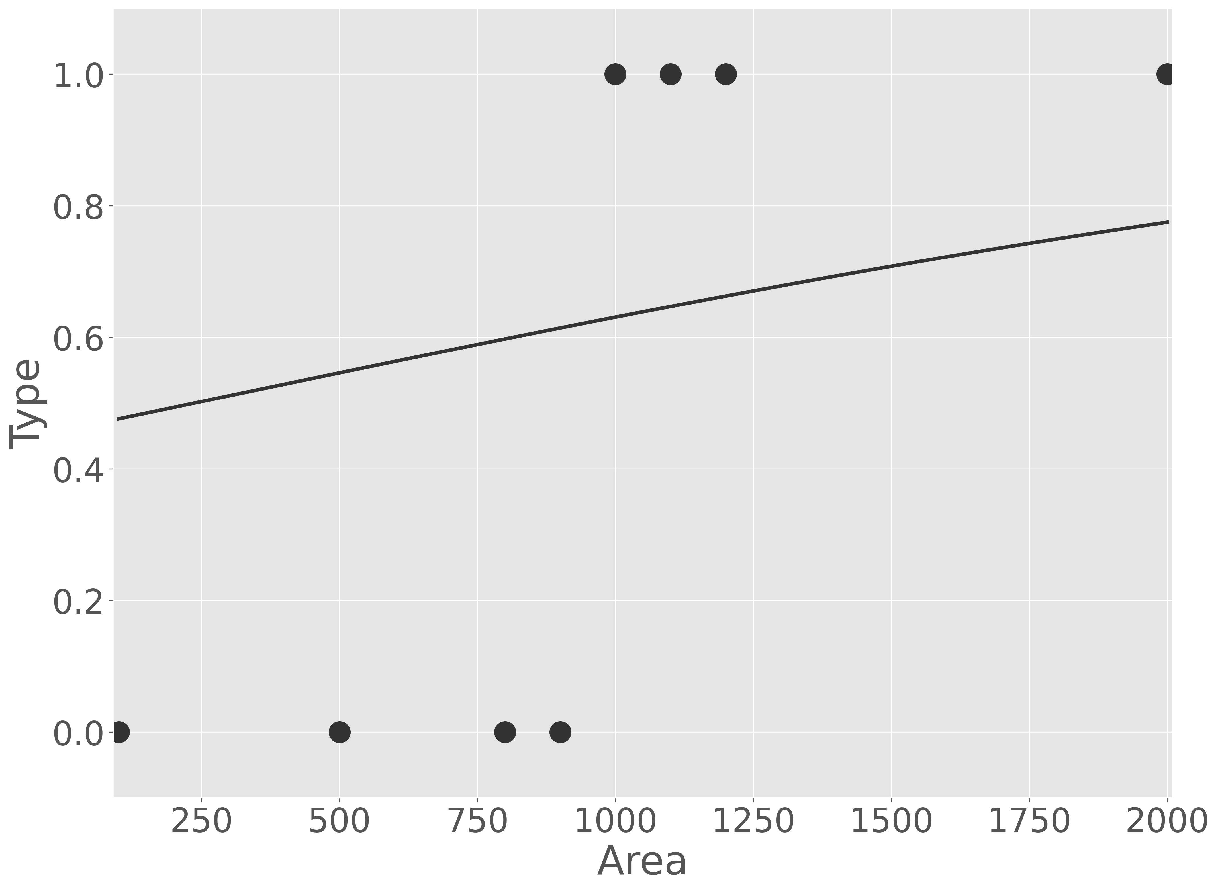
この結果、確かに回帰分析の出力値が最大値と最小値を 0 と 1 の間の数値に変更されたように見えます。しかし、このモデルは実際の観測データと大きくかけ離れています。そこで、回帰分析の出力値をそのままシグモイド関数に代入するのではなく、その出力値にいくつか係数を足したり、かけたりしてみよう。例えば、次のようにします。
Show code cell source
import numpy as np
import pandas as pd
import matplotlib.pyplot as plt
import sklearn.datasets
import sklearn.model_selection
import sklearn.linear_model
import sklearn.preprocessing
import sklearn.decomposition
import sklearn.pipeline
import sklearn.metrics
model = sklearn.linear_model.LinearRegression()
X = np.array([[2000], [1200], [1100], [1000], [900], [800], [500], [100]])
Y = np.array([[1], [1], [1], [1], [0], [0], [0], [0]])

model.fit(X, Y)
xx = np.linspace(min(X), max(X), 1000)
yy = model.predict(xx.reshape(-1, 1))
yy = 1 / (1 + np.exp(- 100 * yy + 50))

fig = plt.figure()
ax = fig.add_subplot()
ax.scatter(X, Y)
ax.plot(xx, yy)
ax.set_xlim(min(X) - 10, max(X) + 10)
ax.set_ylim(min(Y) - 0.1, max(Y) + 0.1)
ax.set_xlabel('Area')
ax.set_ylabel('Type')
plt.show()
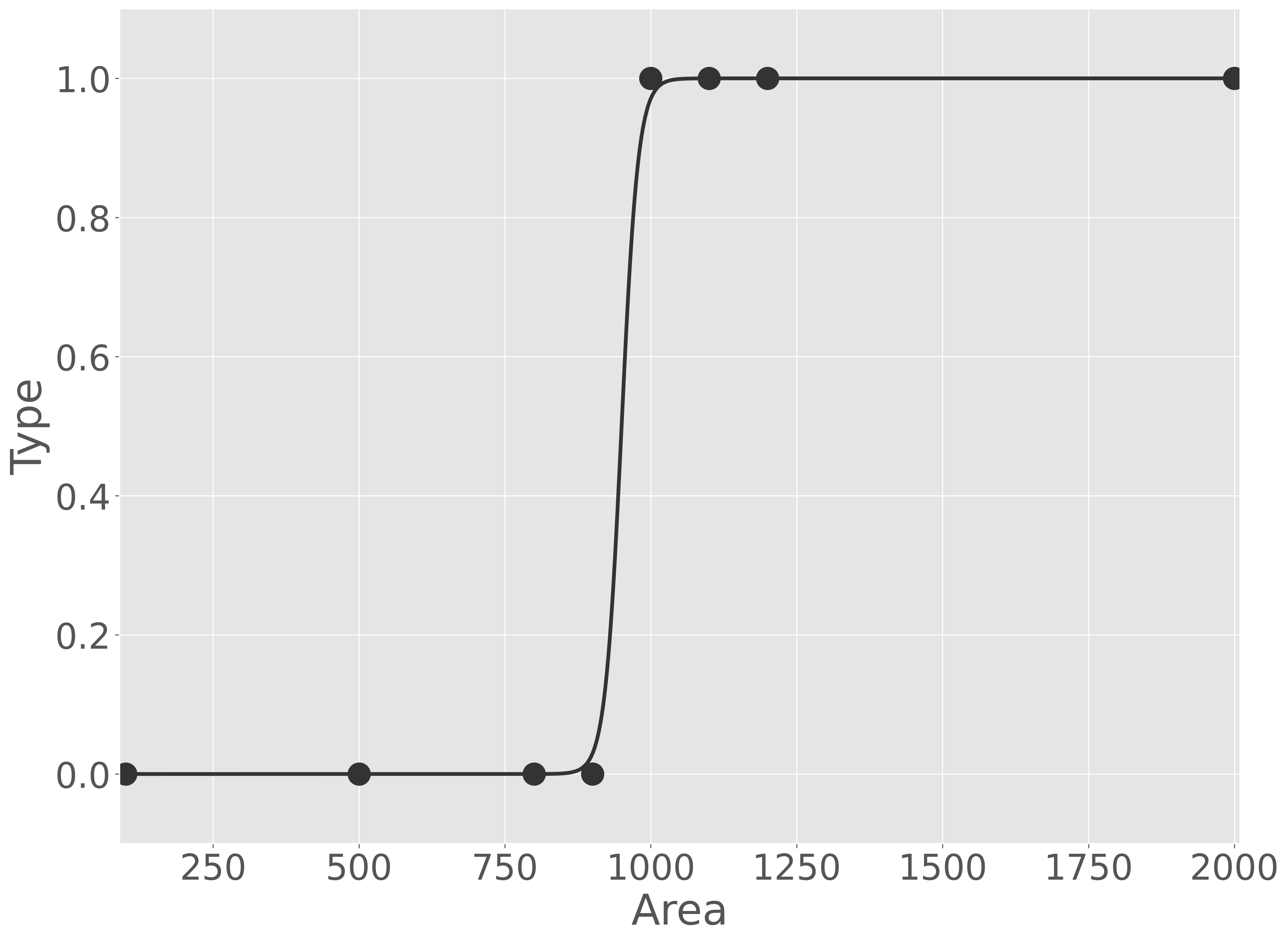
適切に係数を与えれば、観測データを正しく説明できるモデルが得られることがわかりました。
また、この式を変形していくと、
となることから、結局、これは回帰分析とそれをシグモイド関数の形を調整するパラメーターを同時に推定すればいいということになります。つまり、観測データ(\(Y\) および \(X\))を次式に代入し、
モデルの予測値(\(\frac{1}{1 + e^{- (\beta_{1}X + \beta_{0})}}\))と観測値(\(Y\))の差が最も小さくなるような \(\beta_{1}\) および \(\beta_{0}\) を推定することになります。
特徴量が複数ある場合は、ロジスティック回帰は次式で表現できます。また、回帰分析と同様に、特徴量が複数ある場合は、すべての特徴量に対して標準化を行い、平均 0、分散 1 となるように変換を行うと、最適なパラメータを推定しやすくなります。
1.5.2. 演習準備#
本節では、scikit-learn ライブラリが提供している breast cancer データセットを利用して、腫瘍細胞の形状や組織の性質に関する様々な特徴を使って、その腫瘍細胞が良性(benign)または悪性(malignant)を予測することを例に、ロジスティック回帰を説明します。
本節では、次の Python ライブラリを利用します。numpy、pandas、matplotlib ライブラリはデータの読み込みや整形、可視化などに利用します。sklearn はサンプルデータセットの取得およびデータセットを訓練サブセットと検証サブセットに分けるために利用します。
import numpy as np
import pandas as pd
import matplotlib.pyplot as plt
import sklearn.datasets
import sklearn.model_selection
import sklearn.linear_model
import sklearn.decomposition
import sklearn.preprocessing
import sklearn.pipeline
import sklearn.metrics
sklearn.datasets から breast cancer データセットを取得し、pandas で整形します。整形後のデータについて、1 列目は腫瘍細胞の種類を示す 0 または 1 が入っています。sklearn.datasets の breast cancer データでは良性(benign)であれば 1 、悪性(malignant)であれば 0 としています。今回、悪性かどうかを予測したいので、悪性を 1 として、良性を 0 に置換します。また、2 列目以降は腫瘍細胞の画像から測定した 30 種類の特徴や性質(例えば、腫瘍細胞の半径、周長、面積、対称性など)を示す値が記録されています。
data = sklearn.datasets.load_breast_cancer()
Y = data.target
X = data.data
data = pd.concat([
    pd.Series(Y^(Y&1==Y), name='Y'),
    pd.DataFrame(X, columns=data.feature_names),
], axis='columns')
data.head()
| Y | mean radius | mean texture | mean perimeter | mean area | mean smoothness | mean compactness | mean concavity | mean concave points | mean symmetry | mean fractal dimension | radius error | texture error | perimeter error | area error | smoothness error | compactness error | concavity error | concave points error | symmetry error | fractal dimension error | worst radius | worst texture | worst perimeter | worst area | worst smoothness | worst compactness | worst concavity | worst concave points | worst symmetry | worst fractal dimension | |
|---|---|---|---|---|---|---|---|---|---|---|---|---|---|---|---|---|---|---|---|---|---|---|---|---|---|---|---|---|---|---|---|
| 0 | 1 | 17.99 | 10.38 | 122.80 | 1001.0 | 0.11840 | 0.27760 | 0.3001 | 0.14710 | 0.2419 | 0.07871 | 1.0950 | 0.9053 | 8.589 | 153.40 | 0.006399 | 0.04904 | 0.05373 | 0.01587 | 0.03003 | 0.006193 | 25.38 | 17.33 | 184.60 | 2019.0 | 0.1622 | 0.6656 | 0.7119 | 0.2654 | 0.4601 | 0.11890 |
| 1 | 1 | 20.57 | 17.77 | 132.90 | 1326.0 | 0.08474 | 0.07864 | 0.0869 | 0.07017 | 0.1812 | 0.05667 | 0.5435 | 0.7339 | 3.398 | 74.08 | 0.005225 | 0.01308 | 0.01860 | 0.01340 | 0.01389 | 0.003532 | 24.99 | 23.41 | 158.80 | 1956.0 | 0.1238 | 0.1866 | 0.2416 | 0.1860 | 0.2750 | 0.08902 |
| 2 | 1 | 19.69 | 21.25 | 130.00 | 1203.0 | 0.10960 | 0.15990 | 0.1974 | 0.12790 | 0.2069 | 0.05999 | 0.7456 | 0.7869 | 4.585 | 94.03 | 0.006150 | 0.04006 | 0.03832 | 0.02058 | 0.02250 | 0.004571 | 23.57 | 25.53 | 152.50 | 1709.0 | 0.1444 | 0.4245 | 0.4504 | 0.2430 | 0.3613 | 0.08758 |
| 3 | 1 | 11.42 | 20.38 | 77.58 | 386.1 | 0.14250 | 0.28390 | 0.2414 | 0.10520 | 0.2597 | 0.09744 | 0.4956 | 1.1560 | 3.445 | 27.23 | 0.009110 | 0.07458 | 0.05661 | 0.01867 | 0.05963 | 0.009208 | 14.91 | 26.50 | 98.87 | 567.7 | 0.2098 | 0.8663 | 0.6869 | 0.2575 | 0.6638 | 0.17300 |
| 4 | 1 | 20.29 | 14.34 | 135.10 | 1297.0 | 0.10030 | 0.13280 | 0.1980 | 0.10430 | 0.1809 | 0.05883 | 0.7572 | 0.7813 | 5.438 | 94.44 | 0.011490 | 0.02461 | 0.05688 | 0.01885 | 0.01756 | 0.005115 | 22.54 | 16.67 | 152.20 | 1575.0 | 0.1374 | 0.2050 | 0.4000 | 0.1625 | 0.2364 | 0.07678 |
これらのデータを 8:2 の割合に分割し、8 割のデータをモデルを作るのに利用し、残りの 2 割をモデルの予測性能を検証するために利用します。
train_data, valid_data = sklearn.model_selection.train_test_split(data, test_size=0.2, random_state=0)
1.5.3. 演習(1 特徴量)#
ロジスティック回帰の仕組みを見ていくために、1 つの特徴量だけで腫瘍細胞の種類を予測するロジスティック回帰モデルを作成してみよう。breast cancer データセットには 30 種類の特徴量がありますが、ここでは腫瘍細胞の平均周長(mean perimeter)だけを使って腫瘍細胞の種類を予測します。まず、両者の関係を図示します。
Show code cell source
fig = plt.figure(tight_layout=True)

ax1 = fig.add_subplot(2, 1, 1)
ax1.hist(data.loc[data['Y'] == 0, 'mean perimeter'], label='0', alpha=0.5, bins=20)
ax1.hist(data.loc[data['Y'] == 1, 'mean perimeter'], label='1', alpha=0.5, bins=20)
ax1.set_xlabel('mean perimeter')
ax1.set_ylabel('count')
ax1.legend()

ax2 = fig.add_subplot(2, 1, 2)
x_ = data['mean perimeter']
y_ = data['Y'] + np.random.uniform(-0.05, 0.05, len(data))
ax2.scatter(x_[y_ < 0.5], y_[y_ < 0.5], label='0', alpha=0.5)
ax2.scatter(x_[y_ > 0.5], y_[y_ > 0.5], label='1', alpha=0.5)
ax2.set_xlabel('mean perimeter')
ax2.set_ylabel('count')
ax2.legend()

fig.show()
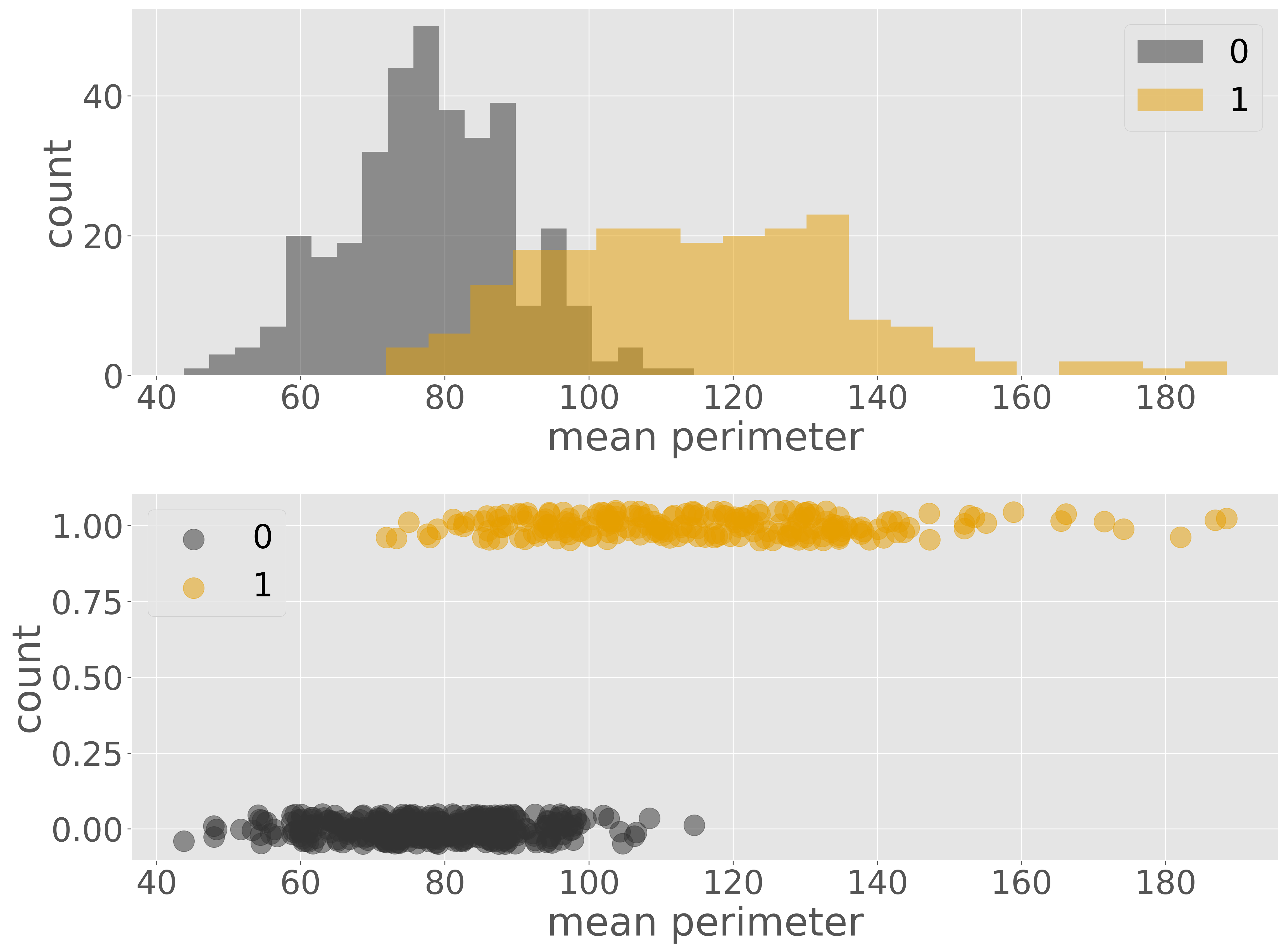
腫瘍細胞の種類とその平均周長と可視化した結果から、平均周長が長いほど悪性(0)である傾向が見られます。つまり、平均周長の値が小さいほど 0.0 に近い値を出力し、平均周長の値が大きければ 1.0 に近い値を出力関数を見つけ、その関数に対して係数調整をすればよいです。そこで、腫瘍細胞の種類を目的変数 \(Y\) とし、平均周長を特徴量 \(X\) としてロジット関数を用いてこれをモデル化することにします。
この式において、80〜100 の間でロジット関数の出力値を 0 付近から 1 付近に変化するように \(\beta_{1}\) および \(\beta_{0}\) を決めていきます。
model = sklearn.linear_model.LogisticRegression()
model.fit(train_data[['mean perimeter']], train_data['Y'])
推定されたパラメータを表示してみます。
print(f'beta_0: {model.intercept_[0]}; beta_1: {model.coef_[0][0]}')
beta_0: -15.168009927839366; beta_1: 0.1580131266707904
次に、このパラメータを持つロジット関数を、訓練データに重ね描き、モデルを可視化します。
Show code cell source
fig = plt.figure()

ax = fig.add_subplot()
x_ = train_data['mean perimeter']
y_ = train_data['Y'] + np.random.uniform(-0.05, 0.05, len(train_data))
ax.scatter(x_[y_ < 0.5], y_[y_ < 0.5], label='0', alpha=0.5)
ax.scatter(x_[y_ > 0.5], y_[y_ > 0.5], label='1', alpha=0.5)
ax.set_xlabel('mean perimeter')
ax.set_ylabel('count')
ax.legend()

x_ = np.linspace(data['mean perimeter'].min(), data['mean perimeter'].max(), 100)
y_ = model.predict_proba(x_.reshape(-1, 1))[:, 1]
ax.plot(x_, y_)


fig.show()
可視化の結果から、このモデルは、平均周長が 80 〜 100 の範囲において、良性と悪性の腫瘍細胞の両方が存在しているため、両者を綺麗に分けることはできませんが、それ以外の範囲では腫瘍細胞の種類を正しく分けられていることが読み取れます。次に、検証サブセットを利用して、予測性能を計算します。
pred = model.predict(valid_data[['mean perimeter']])
acc = sklearn.metrics.accuracy_score(valid_data['Y'], pred)
recall = sklearn.metrics.recall_score(valid_data['Y'], pred)
precision = sklearn.metrics.precision_score(valid_data['Y'], pred)
print(f'accuracy: {acc}; recall: {recall}; precision: {precision}')
accuracy: 0.9122807017543859; recall: 0.8723404255319149; precision: 0.9111111111111111
検証の結果、正解率は 0.912 でした。さらに詳細に見ると、実際に悪性であった患者の中で悪性腫瘍を正しく悪性と予測できた割合(再現率)は 0.872 となりました。このモデルを使用すると、治療を必要とする患者を 2 割ほど見逃すリスクがあります。また、悪性と予測された患者のうち、実際に悪性であった割合(適合率)は 0.911 でした。この結果から、良性にもかかわらず悪性と予測された患者も一定数存在することが分かります。このような誤予測により、一部の患者に不必要な不安を与えたり、医療現場で二次スクリーニングの負担を増やしてしまう可能性があります。再現率と適合率のいずれの観点から見ても、現段階ではこのモデルを実用化することは難しいと判断されます。
1.5.4. 演習(複数特徴量)#
特徴量を増やしたとき、予測性能はどの程度改善していくのかを調べていきます。まず、すべての特徴量の分布を確認します。
Show code cell source
fig = plt.figure(figsize=(40, 30), tight_layout=True)

for i in range(len(data.columns) - 1):
    ax = fig.add_subplot(5, 6, i + 1)
    x0 = data.loc[data['Y'] == 0, :].iloc[:, i + 1]
    x1 = data.loc[data['Y'] == 1, :].iloc[:, i + 1]
    ax.hist(x0, label='0', alpha=0.5, bins=20)
    ax.hist(x1, label='1', alpha=0.5, bins=20)
    ax.set_xlabel(data.columns[i + 1])
ax.legend()

fig.show()
可視化の結果をみると、mean perimeter の分布は 0 と 1 でよく分離されています。その他に、mean area、mean concave points、worst perimeter などのも 0 と 1 を分けているように見えます。ここで、特に何も考えずに、すべてのデータを利用してモデル化してみます。たとえば、30 ある特徴量準備 \(X_{1}, X_{2}, X_{3}, \cdots, X_{30}\) として、モデルをつくり、それぞれの特徴量に対するパラメータを推測していきます。
なお、説明変数が多くなると、様々な単位を持つ特徴量が現れます。そのままでは、パラメーター推定時に、値の大きい特徴量に重みがかかり、最適なパラメーターが推定できなくなる可能性があります。そのため、モデル化する前にすべての特徴量に対して、平均 0、分散 1 となるようにスケーリングします。
model = sklearn.pipeline.Pipeline([
    ('scaler', sklearn.preprocessing.StandardScaler()),
    ('lr', sklearn.linear_model.LogisticRegression()),
])
model.fit(train_data.drop(columns=['Y']), train_data['Y'])
パラメータを推測するさいに各特徴量を同じスケールに揃えたので、それぞれの特徴量にかかる係数(パラメーター)の値を見ることで、それぞれの特徴量が細胞の種類にどのように貢献しているのかを解釈することができます。例えば、次のようにパラメータを棒グラフで可視化すると、radius error、worst texture、area error、worst concave points あたりの特徴量の値が大きいほど細胞が悪性となりやすいように見えます。また、fractal dimension error や compactness error あたりの特徴量が大きいほど良性である傾向が見られる。
fig = plt.figure()
ax = fig.add_subplot()
ax.bar(data.columns[1:], model.named_steps['lr'].coef_[0])
ax.set_xticklabels(ax.get_xticklabels(), rotation=90)
fig.show()
検証サブセットを利用して、このモデルの性能を計算します。
pred = model.predict(valid_data.drop(columns=['Y']))
acc = sklearn.metrics.accuracy_score(valid_data['Y'], pred)
recall = sklearn.metrics.recall_score(valid_data['Y'], pred)
precision = sklearn.metrics.precision_score(valid_data['Y'], pred)
print(f'accuracy: {acc}; recall: {recall}; precision: {precision}')
accuracy: 0.9649122807017544; recall: 0.9574468085106383; precision: 0.9574468085106383
このように、特徴量を増やすことで、モデルの予測性能が大幅に改善されることわかりました。